
...I was in a letterpressing course in Asheville a few weeks ago, at this really swank place called Asheville Book Works. It was really fantastic to be in western NC again, and especially to see some good friends. These first photos show the final prints I made:
Here is my first major project, a poster with inch-tall wood block letters. I tried not to deliberate over something cool to write, and just made a poster encouraging illiteracy or something like that. It is a two color print, which means I ran each poster through twice. The first run was the light blue color. Then I rearranged the text tray (which you can see towards the bottom of this post) by removing and adding letters and graphics, and then used a darker green for the second print. You can see where the text overlaps and where it doesn't. Also, if you flip a letter upside down, you get a square shape with the grain of the wood, which adds a nice effect. There is a double meaning that comes out with the two color process: in blue 'text is an endless train' and in green 'text is endless'.


...my final project, a combination wood/ lead type setup with a bunch of on-the-spot nonsense like portraits and upside down letters. I tried to use the woodblock as a geometric or compositional element rather than actual letters. Even the paragraph itself is somewhat vague and meaningless. I think it follows with the medium- outdated, overly difficult, processed manually. So the words feel like some misplaced morse code transcription or even worse, a quote from a crappy old communications textbook. But I think it works with the jumbled block letters and church registry photos from who knows when.
 ...you can see the impression from the lead type hitting the paper...
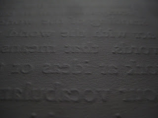
My instructor, Frank Brannon, who runs a small hand-publishing operation out of his house, cranks on the Vandercook press.

Here is the press, inked and ready to run a poster over the text.

setup is somewhat complicated: all the text has to be backwards, and packed so that it won't fall apart under the press.

...this is actually the beginning of the project, setting up type and filling in the empty spaces with hunks of lead.

and seriously, stay tuned. In the near future, you will find a quarterly photography update (lots of lost factories and the like) and some absolutely astounding theories on just about everything, but mainly about allegories and maps and bread rising.
brett

1 comment:
and maybe some theories on vegetable gardens and the like...
Post a Comment